


SoundScape
Human-Computer Interaction Junior Year Semester-Long Class Project
The Challenge:
“Technology-based experiences in
difficult environments”- design an experience intended to be used in non-traditional, complex settings where technology use is non-optimal.
Scope: 15 weeks
Role: UX designer, Visual Designer, and Researcher
Tools: Figma and Miro
Processes: User Research (Interviews & Surveys), User Personas, Requirement Gathering, Wireframing, Lo-Fi and Hi-Fi Prototyping, Affinity Mapping, Visual Design, A/B Testing, Task Flows
Project outline:
This a semester-long project, submitted in four phases:
Phase 1: Analysis
Phase 2: Design
Phase 3: Prototyping
Phase 4: Evaluation
The analysis and design phases are complete. In the next section, the analysis phase will be shown.
Analysis
Concept Statement:
The SoundScape mobile app is designed to enhance the concert experience by providing concertgoers with timely and relevant information, allowing them to focus more on the performance and less on logistical details.
Available on both mobile devices and Apple Watches, SoundScape offers two primary features:
Real-time notifications of upcoming songs in the artist’s setlist
Up-to-date wait-time information for food, beverage, and merchandise lines
By delivering these updates efficiently, the app ensures users spend minimal time interacting with their devices, maximizing their enjoyment of the concert. Ultimately, the vision for SoundScape is to transform how concertgoers engage with live performances, making every moment count.
Analysis
Contextual Inquiry
-
The interviews focused on current methods for tracking setlists, navigating the venue, and managing wait-times for food, beverages, and merchandise.
Additionally, we explored how much time participants typically spend on these tasks, aiming to understand how the app can reduce the time spent on planning and logistics. I interviewed my roommate, an avid concertgoer, while my three teammates interviewed their friends
Questions included:
How do you usually prepare for a concert and what type of concert do you usually attend (e.g. festival, stadium)?
What are your biggest frustrations when attending concerts?
During the concert, how do you stay informed about what's happening?
How do you manage time for food, beverages, and merchandise lines at large venues?
Were you aware of any price changes at the door compared to online prices? How did that affect your decision to attend?
How do you decide when to take a break during a concert (e.g., for food, drinks, or restrooms)?
Can you describe a particularly memorable concert experience and made it stand out?
How helpful do you find apps or websites for planning your concert attendance?
Have you ever encountered challenges with connectivity or accessing information while at a concert?
What would make your concert experience more seamless and enjoyable in terms of planning and navigation?
Do you often know the setlist for the concert you are attending?
-
What often makes a concert experience delightful for our target audience:
Getting good pictures
Not missing any of the songs
Efficiently navigating the arena
Successfully avoiding crowds and maximizing time
Concertgoers who like to prepare beforehand often follow these procedures:
Check bag policies
Ensure their phone is fully charged
Make a plan to leave early for standing-only concert
Check out Spotify or the artist’s social media account for the concert setlist provided.
Search for the merchandise other attendees posted from earlier concerts
Factors interviewees say would enhance their concert experience:
Easily accessible parking information
Easily accessible maps of larger venues
Having all of the information concertgoers should know before entering the venue organized in one place
Accessibility to affordable transportation options, such as affordable parking garages or metro stops near venues
-
Long lines for merchandise
Difficulty seeing when the crowd is tall and limited visibility in nosebleed sections without large screens.
Setlists found online are not always accurate because either the user who uploaded the setlists is wrong or the artists choose to skip the song.
Feeling like you must get to the venue extremely early to avoid lines
Poor cell reception causing users to miss updates, calls, and texts from relevant apps and their friends and family
Missing favorite songs due to waiting in lines for the bathroom
Analysis
Contextual Analysis- Affinity Diagramming

After my team gathered the common pain points, frustrations, and goals for concertgoers, I synthesized these points into an affinity diagram.
Analysis
Creating a Usage Model – Hierarchical Task Inventory (Task Flow)
Goal: Staying informed about upcoming songs and minimizing time spent in lines
This HTI model would help highlight how concertgoers interact with the SoundScape app to stay informed about the setlist, check wait times for food, merchandise, and restrooms, and manage their time efficiently.
We chose to implement a usage hierarchical task inventory model because it effectively breaks down the user’s goals into actionable steps, making it clear where the app can intervene to make processes smoother and more enjoyable.

The steps are outlined in sequence, showing how users manage their concert experience, from opening the app to returning to the stage in time for their favorite songs. Each task is connected by arrows to represent the user’s decision-making flow and how the app simplifies time management.
This approach will highlight specific user actions, allowing for a detailed analysis of micro-interaction patterns.
Analysis
Gathering Design Requirements
Offline Functionality
The app must have excellent offline functionality, meaning that it can carry out its functions efficiently in the absence of a stable internet connection. This is a requirement due to the commonly reported poor cell reception in concert venues.
Interactive venue map
The app must have an interactive map of the venues accessible through the app that users can click on to zoom into and highlight their destination. The map must include bathrooms, merchandise stands, and spots where pictures have been frequently taken.
Setlist queue
The app must have a display of the setlist accessible on mobile and on smartwatches. The setlist being accessible on both devices reduces the number of times a concertgoer must check their phone or hold it above their head waiting for a song to come on. This is a requirement because concertgoers often miss songs.
List of wait times for bathrooms and merchandise
The app must have wait times for the bathroom and merchandise available. This is a requirement because long lines are a common damper on concert experiences, which was expressed in the work activity notes.
Dark Mode Display
The app must be in dark mode due to the dark nature of concert venues. This is a requirement because we want to consider accessibility standards and inclusivity at each step of the design process, and dark mode would allow the most visible screens. Bright white, eye-straining in dark concert venues phone screens were also a common user complaint.
Project Outline:
The team has now completed the analysis and design phase of the project. The prototyping and evaluation phase will be assigned to the class within the next few weeks remaining in the semester
Phase 1: Analysis
Phase 2: Design
Phase 3: Prototyping
Phase 4: Evaluation
In the next section, the design phase will be shown.
Design
User Personas
Traditionally, in my design process, I would include user personas in the analysis section. However, this class includes user personas in the design phase.

I created the target persona for SoundScape with the user research from phase 1 (analysis) in mind. Most of the interviewees who expressed that they would be likely to use the app were frequent concertgoers who were sociable and like to plan ahead.
When discussing their experiences with concerts in the past, concert lovers often expressed in the interviews their passion for certain genres and specific artists but stated feeling constantly stressed at concerts as a complaint. These themes were included in Cassie’s interests & hobbies, and weaknesses section.


Design
User Persona Explanations
-
The first secondary persona is based on interviewees who attend concerts regularly but have different priorities compared to Cassie. They may focus on discovering new artists or prefer smaller, intimate venues. Their needs from SoundScape would center more around getting information about the venue layout, artist discovery, and social interaction during events.
While Jake enjoys the music, he often finds attending a concert can be stressful. He dislikes the uncertainty of navigating large, unfamiliar venues with limited signage and poor information about where to find amenities. Waiting in long lines for food, drinks, and merch is particularly frustrating for him, as it pulls him away from the music he came to enjoy. Despite his love for live shows, the overall experience can sometimes feel overwhelming due to the large crowds and noise, especially because Jake doesn’t attend concerts frequently enough to be familiar with the typical flow of events.
Jake’s main goal when attending a concert is to have a smooth, stress-free experience, where he can focus on the music rather than worrying about logistics. He would love a tool that helps him navigate the venue, provides real-time updates on wait times for food, drinks, and restrooms, merch, and keeps him informed about the setlist so he can anticipate his favorite songs. Jake represents a less frequent concertgoer who values structure and simplicity, and who needs an app like SoundScape to help manage the chaotic aspects of a live music event, allowing him to focus on what he truly enjoys—immersing himself in the music.
-
The second secondary persona is based on the viewpoint of a concertgoer who has a deeper understanding of event logistics and planning. Her role as a persona is based on an individual who has a deeper understanding of the roles a concertgoer plays beyond just being a music fan. Having someone who can approach concerts with a dual lens—being able to enjoy the music while critically assessing the event experience. By providing this perspective in our persona, we can ensure SoundScape can cater to both casual and professional users.
The team reviewed feedback and observations of how we could involve our stakeholders, such as the performing artist or event employees, in the gathering of information for the application (ie. setlist information, gauging line wait times, etc.) and thinking of how the application could also be geared to address issues in the logistical side of concert planning. As a result, Alexis was selected as a persona who embodies a more work-focused and technical approach while enjoying live events. Her persona reflects the internal conflict of wanting to relax at concerts and the instinct to analyze event management. This persona ensures the application also addresses logistical features like venue organization and event flow while offering emotional engagement for someone who enjoys the concert atmosphere.
Design
Ideation Session Takeaways
The team decided to move away from the ticket cost tracking aspect of SoundScape, since we came to the conclusion that it would not contribute to our goal of creating an application that would help users be more present at their concert experiences.
However, we did want to continue to include the involvement of our stakeholders, such as performing artists and their management teams, and the venue concessions, security, and productions employees.
One major focus we had this phase was on concert preparation, where we envisioned features that would facilitate users in planning their concert outings. For instance, we considered a “Concert Prep Checklist” that would allow users to track what they need to bring or cannot bring.
Additionally, we brainstormed the concept of a personalized “Setlist Playlist” feature that would help users familiarize themselves with songs, enhancing their overall enjoyment during the concert.
Design
Ideation Session Takeaways
Another area of exploration was navigating the venue. We proposed an interactive venue map that would provide real-time updates on the location of food, merchandise, and restroom facilities. This would not only help users find their way but also include a “Hotspot Finder” feature that highlights crowded areas based on user-generated data.
In a big jump, we discussed the possibility of integrating augmented reality elements to guide users to specific location within the venue, allowing them to visualize their paths and avoid congested areas.
These ideation sessions, along with others, generated a wide range of ideas—some feasible and practical, while others stretched the limits of reality—each designed to tackle the specific pain points faced by concertgoers.
Design
Peer Design Critique Session Takeaways
“Find Your Friends” feature would add to the usefulness of the app
A poll system for the artist to use and ask questions like “Which song should I play?” could be a great way for artists to engage with their fans through the app.
Design
Storyboarding
This scenario demonstrates how SoundScape prioritizes efficiency and minimal disruption to a user’s concert experience, allowing concertgoers to make informed decisions in real-time with minimal effort.


For this example, I wanted to emphasize how SoundScape can help users be more present, ensuring efficient use of the application when time is of the essence.
In this storyboard, the user needs to quickly check the setlist to decide whether to use the bathroom, and the interaction with SoundScape is designed to be fast and intuitive. By accessing the application on a smartwatch, SoundScape reduces the effort needed to interact with the app in a busy concert environment. The app immediately scrolls to the next song in the setlist, minimizing the time the user spends navigating the menu. The quick, glanceable interface also encourages short, efficient interactions, allowing the user to put down their technology and remain immersed in the concert experience.
Design
Sketches

Design
Wireframes
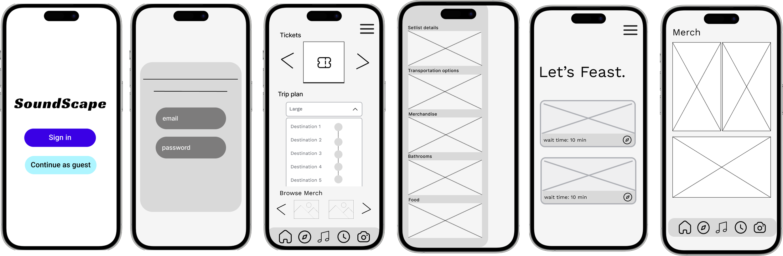
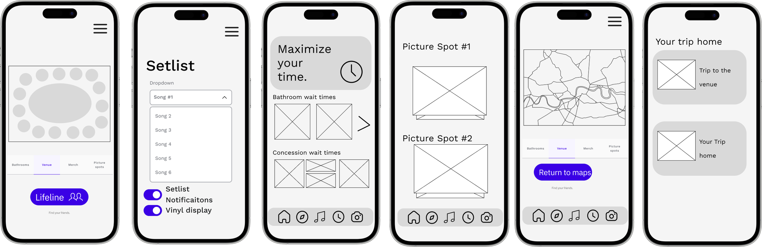
Project Outline:
The team has now completed the analysis and design phase of the project. The prototyping and evaluation phase will be assigned to the class within the next few weeks remaining in the semester
Phase 1: Analysis
Phase 2: Design
Phase 3: Prototyping
Phase 4: Evaluation
In the next section, the design phase will be shown.
Prototype Walkthrough
What I Learned from SoundScape
The faster a design descion “fails” to produce the desired resolution to a problem, the faster we find the correct solution.
This is the benefit of rapid iteration, whihc is a work flow that definitely took some time getting comfortable with. In previous design projects and the early phases of this project, I often felt burnt out after designing for hours on end, which resulted in a lower quality of work than desired.
After deciding to design in short and frequent sprints, we I was able to finish designs several days before the deadlines, which allowed the team to iterate through design choices and solutions quickly.
Asking non-leading and unbiased questions in user interviews
Since this project was dense in user research, I got a lot of practice conducting productive user interviews. Through writing the questions for the user interviews, I learned the importance of focusing the questions on the user journey and pain points, rather than what asking what features the users would like to have.